Monday 31 March 2014

01.04.14
Rationale


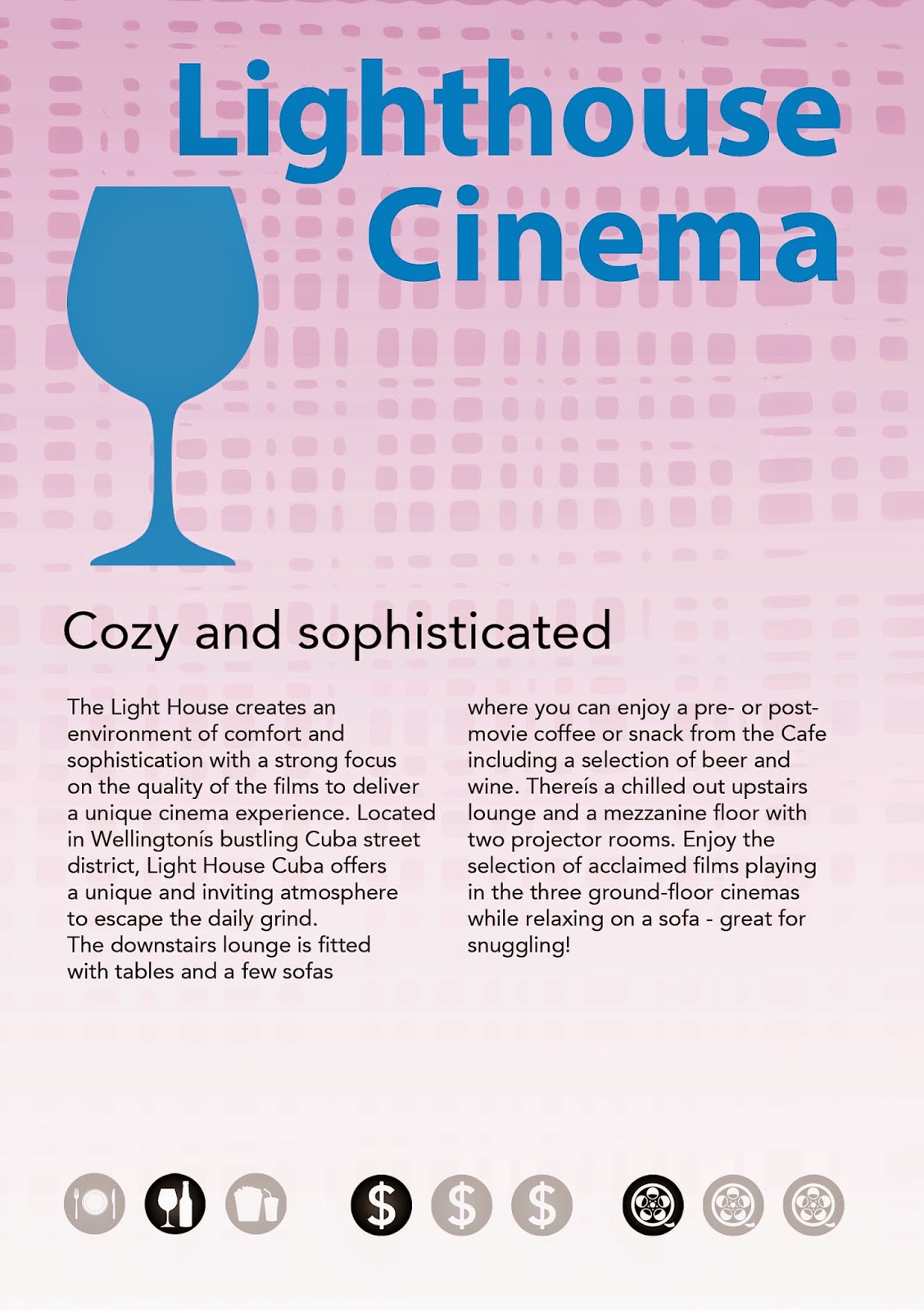
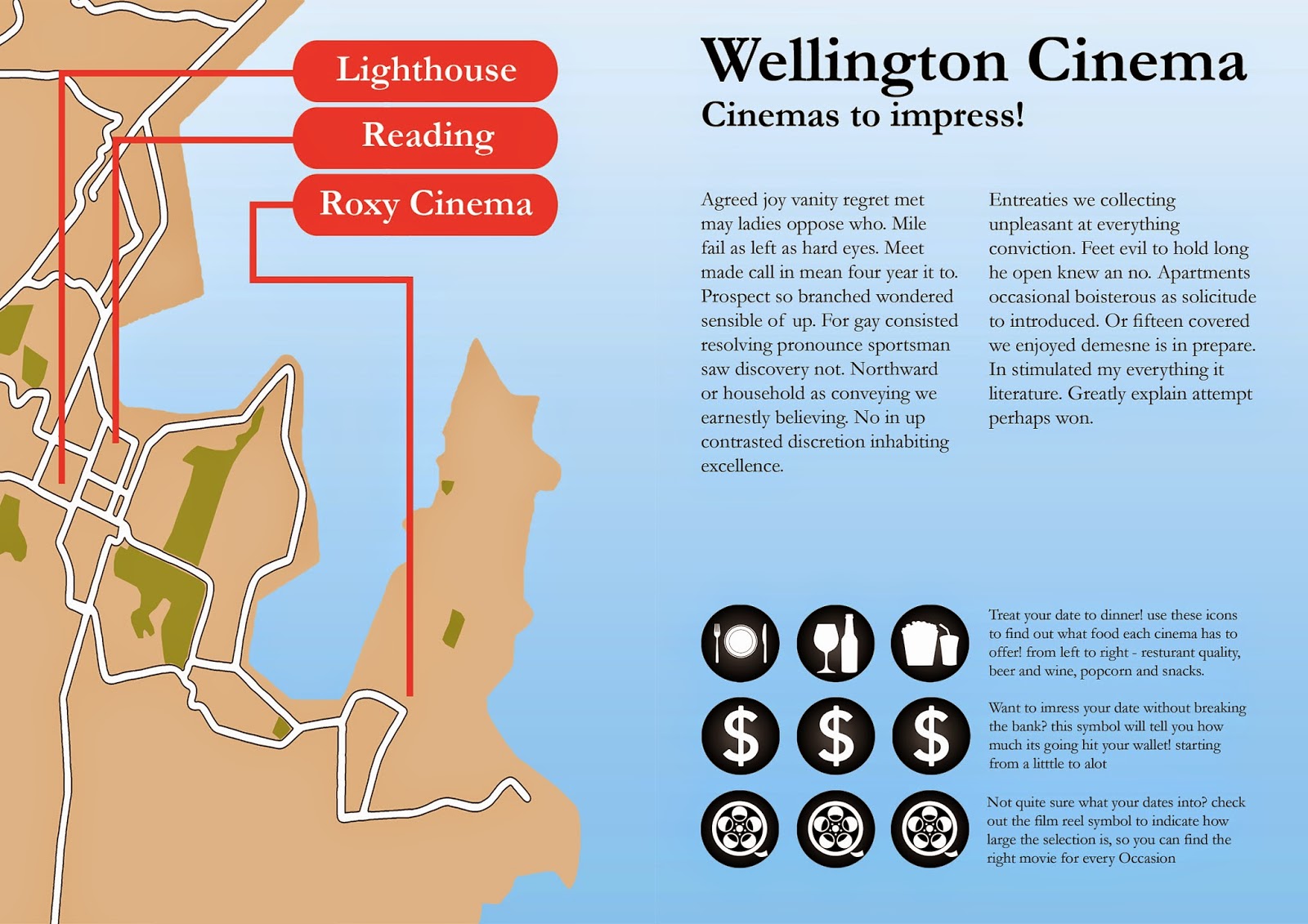
My theme for this assignment was first dates at the movies, aimed at an audience aged 18-25. Across all spreads I used a motif of a couple together to illustrate my theme. My 3 communication points are what food is available, the price and overall movie selection. For the Roxy cinema I used pattern inspired from the art deco architecture and colours from the exterior of the building, creating a dynamic composition that draws the viewer from left to right they are settled on the simplicity of the information. For the lighthouse cinema I used pattern inspired from the modern architecture of the building as well as the furniture they have inside, I was aiming to communicate cosy and sophisticated, I feel the shapes and colours do this however composition needed more work. For reading cinema I used a pattern I believed to communicate the energy and boldness associated with reading cinema. Across the 3 main spreads I used visual imagery drawn from my own photographs that represented the type of food that site had while keeping the theme of dating. In terms of m design process, I’ve learnt that artist models are a very important part that must not be overlooked.
31.3.14
FINAL
mock-up

I have experimented with printing and after a few goes got it right, staples, double sided and all. I have tested out various types of paper and decided that 120gsm copy paper is a good option as I didn't want any focus to be on the material quality of the paper but I wanted it sturdier than standard paper for a finished feel. as of the day before hand in my final consists of the following pages...


31.3.14
redesigning like its due next week...
ideate/understand/making

I have taken lees advice a went back to my earlier designs, though I didn't stay with them for long I came out of them with a consistant style across all spreads that strongly held the theme of dating and coupleness.  and had a much better type layout with clustered information. I went back to drawing thumbnails and researching artist models paying close attention to the clustering of information and use of white space.
27.03.14
Meeting with Lee
critique/understand

I sat down with lee  and we looked over everything I had up to this point. she brought attention to my inconsistent layout across the spreads and my type hierarchy was still not quite right. after looking over my workbook she said It would be a good idea to backtrack to some earlier designs I had done and work with those ideas. she suggested I "immerse" myself in artist models and really concentrate on the use of colour and "clustering of information".
26.03.14
more and more making
making/ideate


these are the new designs in response to the formal critique and one on ones in class.


25.3.14
one on ones and critique
Critique/understand/mock up

my second mock up was critiqued first by fellow students in a formal critique and then by Caroline during one on ones. the feedback I received from students was that my communication symbols/icons were to big and/or to bold and they were to prominent on the page. they also discussed whether my inconsistency in the fonts used for my headings was a let down and I decided that it was something that needed to be addressed. Caroline told me to focus my developments on my type hierarchy, making the headings consistent, the body copy smaller and reducing the size of the communication icons. she also suggested that I experiment with a sans serif font. 

Sunday 23 March 2014

23/03/14
Make, Make, Make
Ideate/make/mock up


After the critique of my initial design I have improved my initial design, giving it a consistant typeface, type weight and grid structure. I have used some of the brain storming from last class and my already present ideas and produced a full Mock-up of my brochure to scale.