31.3.14
FINAL
mock-up
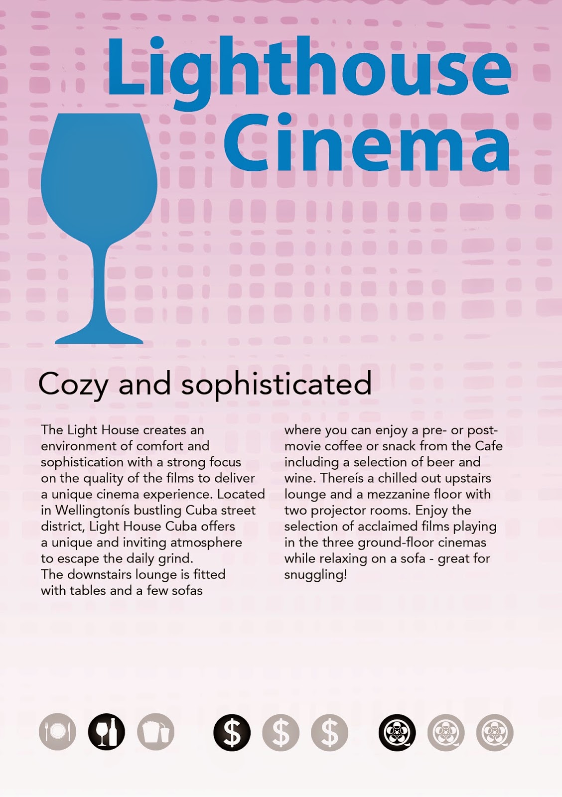
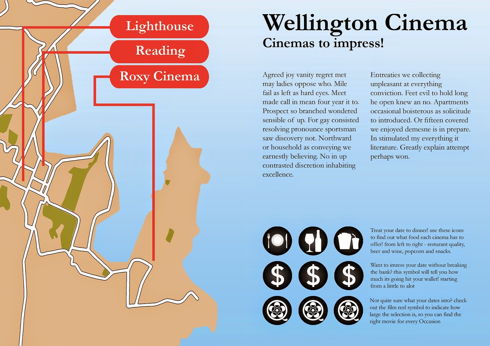
I have experimented with printing and after a few goes got it right, staples, double sided and all. I have tested out various types of paper and decided that 120gsm copy paper is a good option as I didn't want any focus to be on the material quality of the paper but I wanted it sturdier than standard paper for a finished feel. as of the day before hand in my final consists of the following pages...
Showing posts with label Making. Show all posts
Monday, 31 March 2014
31.3.14
redesigning like its due next week...
ideate/understand/making
I have taken lees advice a went back to my earlier designs, though I didn't stay with them for long I came out of them with a consistant style across all spreads that strongly held the theme of dating and coupleness. and had a much better type layout with clustered information. I went back to drawing thumbnails and researching artist models paying close attention to the clustering of information and use of white space.
redesigning like its due next week...
ideate/understand/making
I have taken lees advice a went back to my earlier designs, though I didn't stay with them for long I came out of them with a consistant style across all spreads that strongly held the theme of dating and coupleness. and had a much better type layout with clustered information. I went back to drawing thumbnails and researching artist models paying close attention to the clustering of information and use of white space.
26.03.14
more and more making
making/ideate
these are the new designs in response to the formal critique and one on ones in class.
more and more making
making/ideate
these are the new designs in response to the formal critique and one on ones in class.
25.3.14
one on ones and critique
Critique/understand/mock up
my second mock up was critiqued first by fellow students in a formal critique and then by Caroline during one on ones. the feedback I received from students was that my communication symbols/icons were to big and/or to bold and they were to prominent on the page. they also discussed whether my inconsistency in the fonts used for my headings was a let down and I decided that it was something that needed to be addressed. Caroline told me to focus my developments on my type hierarchy, making the headings consistent, the body copy smaller and reducing the size of the communication icons. she also suggested that I experiment with a sans serif font.
one on ones and critique
Critique/understand/mock up
my second mock up was critiqued first by fellow students in a formal critique and then by Caroline during one on ones. the feedback I received from students was that my communication symbols/icons were to big and/or to bold and they were to prominent on the page. they also discussed whether my inconsistency in the fonts used for my headings was a let down and I decided that it was something that needed to be addressed. Caroline told me to focus my developments on my type hierarchy, making the headings consistent, the body copy smaller and reducing the size of the communication icons. she also suggested that I experiment with a sans serif font.
Sunday, 23 March 2014
23/03/14
Make, Make, Make
Ideate/make/mock up
After the critique of my initial design I have improved my initial design, giving it a consistant typeface, type weight and grid structure. I have used some of the brain storming from last class and my already present ideas and produced a full Mock-up of my brochure to scale.
Make, Make, Make
Ideate/make/mock up
After the critique of my initial design I have improved my initial design, giving it a consistant typeface, type weight and grid structure. I have used some of the brain storming from last class and my already present ideas and produced a full Mock-up of my brochure to scale.
23/03/14
Critique and problem areas
Making/Critique/Understand
I took my initial brochure mock up to class in which it was critiqued, I've realised that consistency is an issue that needs to be sorted, as is my grid structure which varies from page to page. We a lectorial on typography which helped me understand where I went wrong and what I need to do to improve my design.
Sunday, 16 March 2014
16.03.2014
Mock-up Time!
Making
I've made a mock up of my brochure using Photoshop, Illustrator and InDesign. I have used the thumbnails I completed within the grid template and have applied the grid concept to my designs. I Also Sourced content from the various websites and reviews to produce the text contained within my brochure.
Mock-up Time!
Making
I've made a mock up of my brochure using Photoshop, Illustrator and InDesign. I have used the thumbnails I completed within the grid template and have applied the grid concept to my designs. I Also Sourced content from the various websites and reviews to produce the text contained within my brochure.
16.03.2014
Critique of Initial Designs
Critique
My Initial Designs were critiqued in class. I've been made to realise that I need to reflect the differences in my sites more strongly. fellow students determined that the film strip was a strong element as was the dancer. however the bottle and glass of the lighthouse was to dominant for the overall composition.
Critique of Initial Designs
Critique
My Initial Designs were critiqued in class. I've been made to realise that I need to reflect the differences in my sites more strongly. fellow students determined that the film strip was a strong element as was the dancer. however the bottle and glass of the lighthouse was to dominant for the overall composition.
Sunday, 9 March 2014
09.03.2014
New Research and New Ideas
Define/Ideate/making/Ideate
Armed with my new set of research and set up a page defining different
visual elements of the 3 signs for each site.
I also gathered more visual examples that I felt were honing in on a few particular styles.
I have produced a set of three A5 designs I fell depict my sites much more closely.
New Research and New Ideas
Define/Ideate/making/Ideate
Armed with my new set of research and set up a page defining different
visual elements of the 3 signs for each site.
I also gathered more visual examples that I felt were honing in on a few particular styles.
I have produced a set of three A5 designs I fell depict my sites much more closely.
9.3.2014
Gathered Material and Produced Collages
Understand/Ideate/Making
I have Gathered Visual material and artist models and produced 3
collages/designs that I believe contain 3 signs based from my research.
Gathered Material and Produced Collages
Understand/Ideate/Making
I have Gathered Visual material and artist models and produced 3
collages/designs that I believe contain 3 signs based from my research.
Subscribe to:
Posts (Atom)